Moody Interior Design: How to Use Dark Paint Colors Confidently
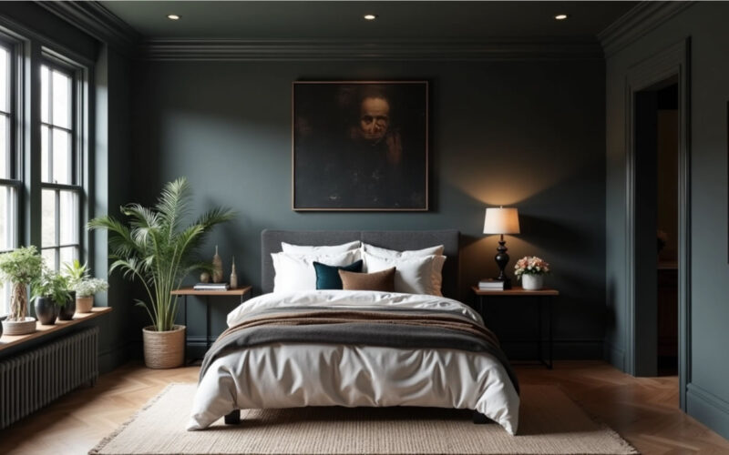
Embracing dark, atmospheric paint colors—like charcoal, deep navy, forest green, plum, and chocolate brown—is one of the most transformative ways to add drama, intimacy, and architectural depth to a home. Yet, many homeowners hesitate, fearing that dark colors will make a room feel small, claustrophobic, or overly gloomy.
When done with intention, dark paint does not shrink a room; instead, it blurs room boundaries, elevates natural textures, and creates an inviting, boutique-hotel ambiance. Here is how to use rich, dark paint colors with total design confidence.
1. Commit to “Color Drenching”
The single biggest mistake when using dark paint is stopping at the drywall. Painting dark walls against crisp white baseboards and doors creates harsh, high-contrast visual lines that highlight the exact boundaries of the room, making it feel smaller.
-
Color Drench Everything: Paint the walls, baseboards, door frames, window trim, and even the ceiling in the same dark shade (or a slightly lighter tint of the same color on the ceiling).
-
Blur the Corners: Enveloping the space in a single dark shade erases hard edges, tricking the eye into perceiving endless spatial depth.
-
Vary the Sheen: Keep walls in an eggshell or flat/chalk finish to absorb light softly, while using a satin or semi-gloss finish on trim and doors for durability and subtle light reflection.
┌────────────────────────────────────────────────────────────────────────┐
│                        MOODY LIGHTING & FINISH FORMULA                 │
│                                                                        │
│   SURFACE FINISHES              ┌──────────────────────┐               │
│   (Flat Walls & Satin Trim)     │ Color Drenching      │               │
│                                 └──────────┬───────────┘               │
│                                            │                           │
│   WARM LIGHTING                            ▼                           │
│   (2700K Low-Level Glow)        ┌──────────────────────┐               │
│                                 │ Lamps & Sconces      │               │
│                                 └──────────┬───────────┘               │
│                                            │                           │
│   HIGH-CONTRAST TEXTURES                   ▼                           │
│   (Wood, Metals & Textiles)     ┌──────────────────────┐               │
│                                 │ Oak, Brass & Velvet  │               │
│                                 └──────────────────────┘               │
└────────────────────────────────────────────────────────────────────────┘
2. Embrace Small or Low-Light Spaces (Don’t Fight the Darkness)
A common interior design misconception is that dark, windowless rooms must be painted white to brighten them up. In reality, painting a low-light room white often results in a dull, shadowy gray space.
-
Lean Into the Moodiness: Powder rooms, home offices, media rooms, and bedrooms with small windows are prime candidates for dark paint. Embracing the lack of natural light creates an intentionally cozy, intimate “jewel box.”
-
Choose the Right Room Intent: Use dark colors where you want to promote rest, focus, or evening relaxation.
3. Layer Warm, Low-Level Accent Lighting
Harsh overhead lighting ruins moody interiors, casting cold glares across dark walls. Moody spaces demand layered, low-level illumination.
-
Warm Bulb Temperatures: Stick strictly to warm light bulbs between 2700K and 3000K. Cold blue light ($4000\text{K}+$) turns rich dark paint chalky and sterile.
-
Pool Light at Eye Level: Rely on table lamps, wall sconces, floor lamps, and picture lights rather than strong ceiling recessed lights. Soft pools of warm light bouncing off dark walls create an instant luxury lounge atmosphere.
4. Contrast with High-Tactile Textures & Warm Metals
Because dark walls absorb light, you must reintroduce warmth, reflection, and tactile depth through furniture, textiles, and hardware.
-
Rich Wood Finishes: Pair dark walls with warm wood furniture—such as natural oak, walnut, or teak—to ground the space with organic texture. (Review our guide on mixing wood tones to layer these elements effortlessly!)
-
Reflective Metals: Use brushed brass, warm gold, or copper light fixtures, mirror frames, and hardware. Metal accents gleam against dark backdrops like fine jewelry.
-
Plush Textiles: Introduce heavy-textured fabrics like slubbed linen, bouclé, cognac leather, and rich velvet (in ochre, rust, or cream) to keep the room feeling soft and comfortable.
5. Test Swatches Under Real-Life Conditions
Dark paint colors shift drastically depending on the time of day, undertones, and available light. Never select a dark shade from a tiny paper swatch in the store.
-
Paint Large Samples: Paint a $2\text{ ft} \times 2\text{ ft}$ test patch on multiple walls, including near windows and in dark corners.
-
Observe Across 24 Hours: Watch how the color changes from bright morning light to warm evening lamp light. Pay close attention to underlying tones—for example, a deep gray might reveal unexpected purple or green undertones under evening bulbs.
Dark Paint Confidence Cheat Sheet
| Design Element | Avoid This | Do This Instead |
| Trim & Ceiling | Stark white contrast trim | Color drenching (walls, trim & ceiling in one shade) |
| Lighting | Cool 4000K overhead recessed lights | Warm 2700K lamps, sconces & accent picture lights |
| Metals | Polished chrome or cool silver | Warm brushed brass, champagne bronze, or gold |
| Textiles | Flat synthetic fabrics | High-texture bouclé, velvet, cognac leather & slubbed linen |
| Paint Finish | High-gloss on full walls | Flat/Eggshell on walls + Satin/Semi-gloss on trim |
By committing to full-room color drenching, layering warm accent lights, and contrasting dark walls with rich wood tones, brass, and textured fabrics, you can paint with dark colors confidently and transform any room into a sophisticated sanctuary.