How to Mix Patterns and Fabrics Like a Professional Stylist
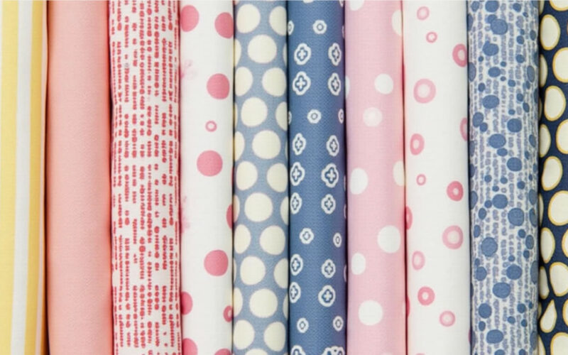
Mixing patterns and fabrics in a room can feel intimidating, but it is one of the most effective ways to give a home a high-end, custom-designed feel. When done poorly, a mix of prints creates visual noise and chaos. When done right, it adds depth, personality, and sophisticated rhythm.
Interior designers rely on a structured approach based on scale variation, dominant color bridges, and textural balance to combine prints and textiles effortlessly. Here is how to mix patterns and fabrics like a pro.
1. Follow the Three-Pattern Rule (Scale Breakdown)
When starting out, stick to a classic three-pattern formula per room or seating zone. The key is ensuring that each pattern belongs to a completely different size scale so they don’t compete for attention.
-
Pattern 1: The Large-Scale Anchor (50%): Choose a bold, large-scale print—such as a large floral, a wide botanical, or an expansive geometric. This sets the tone and color palette for the rest of the mix.
-
Pattern 2: The Medium-Scale Companion (30%): Select a medium-sized print with a distinct shape—like a traditional stripe, plaid, lattice, or houndstooth.
-
Pattern 3: The Small-Scale Accent (20%): Finish with a tight, small-scale print—such as a micro-dot, small block print, or tiny repeating geo pattern. From a distance, small patterns act almost like a solid texture.
┌────────────────────────────────────────────────────────────────────────┐
│                        PATTERN SCALE FORMULA                           │
│                                                                        │
│   ┌────────────────────────────────────────────────────────────────┐   │
│   │                   1. LARGE-SCALE ANCHOR (50%)                  │   │
│   │           (Botanicals, Large Florals, Oversized Geos)          │   │
│   └───────────────┬────────────────────────────────┬───────────────┘   │
│                   │                                │                   │
│                   ▼                                ▼                   │
│   ┌───────────────────────────────┐ ┌──────────────────────────────┐   │
│   │ 2. MEDIUM COMPANION (30%)     │ │  3. SMALL ACCENT (20%)       │   │
│   │ (Stripes, Plaids, Lattices)   │ │ (Micro-Dots, Small Geos)     │   │
│   └───────────────────────────────┘ └──────────────────────────────┘   │
└────────────────────────────────────────────────────────────────────────┘
2. Anchor the Look with a Shared Color Palette
The absolute rule for mixing patterns successfully is that all fabrics must share at least one or two core colors. A shared color palette bridges disparate styles, making a traditional floral and a modern geometric look like they were made for each other.
-
Pick 1 Dominant Color & 2 Accent Colors: Pull colors directly out of your main large-scale pattern and repeat them across your secondary and tertiary patterns.
-
Maintain Undertones: If your anchor print uses a warm olive green, ensure the green in your stripe or micro-print shares the same warm undertone rather than a cool emerald.
                           ┌────────────────────────┐
                           │  ANCHOR MULTI-COLOR    │
                           │     LARGE PRINT        │
                           └───────────┬────────────┘
                                       │
            ┌──────────────────────────┴──────────────────────────┐
            ▼                                                     ▼
┌───────────────────────┐                             ┌───────────────────────┐
│   MEDIUM STRIPE       │                             │   SMALL MICRO-PRINT   │
│ (Pulls Accent Color A)│                             │ (Pulls Accent Color B)│
└───────────────────────┘                             └───────────────────────┘
3. Contrast Your Pattern Styles
Avoid pairing two patterns that have identical shapes and structures, even if they are different scales. Mixing similar styles creates visual tension because the brain tries to process two competing versions of the same concept.
-
Organic vs. Geometric: Pair soft, curved, organic lines (florals, ikats, damasks) with sharp, structured geometric lines (stripes, checks, grids).
-
Classic Pairings:
-
Large Floral + Classic Stripe + Micro-Geometric
-
Oversized Plaid + Medium Botanical + Small Dot
-
4. Layer Textures to Soften Pattern Heavy Rooms
Patterns provide visual interest, but tactile fabrics (textures) bring physical depth and comfort. Without rich fabric textures, a room full of flat printed cottons will look thin and flat.
-
Incorporate Solid Textures: Use solids with heavy texture—such as nubby bouclé, slubbed linen, plush velvet, chunky wool, or supple leather—to give the eye a resting place between busy patterns.
-
Distribute Sheens: Balance matte fabrics (flat linen, wool) with subtle sheen (velvet, silk, polished cotton) to let light bounce off surfaces in varied ways.
5. Distribute Patterns Evenly Throughout the Space
Clustering all your patterned pillows or drapes on one side of the room makes the layout feel heavy and lopsided.
-
Spread the Weight: If you have patterned drapery, balance it with patterned throw pillows on the opposite sofa or an accent rug underfoot.
-
Break Up Patterns with Solid Anchors: Never stack three patterned cushions directly against a heavily patterned sofa. Place patterned pillows against a solid, textured sofa backdrop so the prints stand out clearly.
Pattern & Fabric Mixing Cheat Sheet
| Layer | Recommended Scale | Ideal Pattern / Fabric Type | Role in the Space |
| Primary (50%) | Large Scale | Large Florals, Botanicals, Oversized Geos | Sets the color palette & hero motif |
| Secondary (30%) | Medium Scale | Stripes, Plaids, Lattices, Ikats | Adds structured contrast to organic prints |
| Tertiary (20%) | Small Scale | Micro-Dots, Mini-Block Prints, Houndstooth | Acts as a detailed accent / subtle grounding |
| Texture Buffer | Solid / Textured | Bouclé, Slubbed Linen, Velvet, Leather | Gives the eye a resting place between prints |