How to Choose a Cohesive Home Color Palette Room by Room
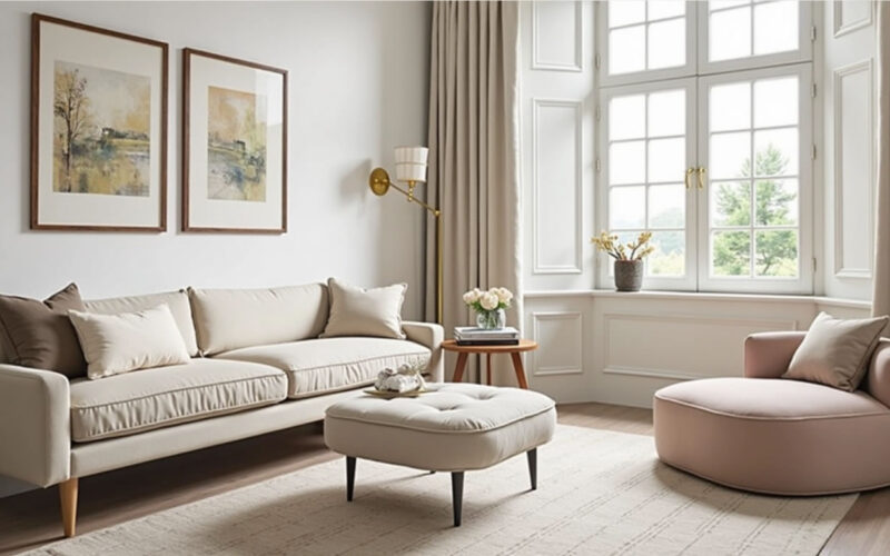
Designing a color scheme that flows naturally from room to room makes a home feel larger, intentional, and harmonious. Without a clear plan, moving from one room to another can feel jarring—like stepping into entirely different houses.
Creating a cohesive color story doesn’t mean painting every wall the exact same color. Instead, it relies on establishing a master palette, carrying undertones across boundaries, and strategically varying color saturation as you move through the floor plan.
1. Establish Your 60-30-10 Whole-House Palette
Before picking paint swatches for individual rooms, build a master palette consisting of 3 to 5 core colors that will serve as the thread throughout your entire home:
-
60% Main Neutral (The Foundation): Used on primary open-concept walls, hallways, entryways, and main living zones.
-
30% Secondary Color (The Anchor): Used for dedicated rooms (e.g., dining room, master bedroom), cabinetry, or large upholstered furniture.
-
10% Accent Colors (The Personality): Used across low-risk decor, accent walls, pillows, rugs, and artwork.
┌────────────────────────────────────────────────────────────────────────┐
│                      WHOLE-HOUSE PALETTE STRUCTURE                     │
│                                                                        │
│   ┌────────────────────────────────────────────────────────────────┐   │
│   │                    60% MAIN NEUTRAL                            │   │
│   │        (Warm Off-White, Greige, or Soft Cream)                 │   │
│   └───────────────────────────────┬────────────────────────────────┘   │
│                                   │                                    │
│   ┌───────────────────────────────▼────────────────────────────────┐   │
│   │                  30% SECONDARY ANCHORS                         │   │
│   │       (Muted Sage, Warm Taupe, Navy, or Terracotta)            │   │
│   └───────────────────────────────┬────────────────────────────────┘   │
│                                   │                                    │
│   ┌───────────────────────────────▼────────────────────────────────┐   │
│   │                  10% ACCENT HIGHLIGHTS                         │   │
│   │       (Brushed Brass, Forest Green, Ochre, or Rust)            │   │
│   └────────────────────────────────────────────────────────────────┘   │
└────────────────────────────────────────────────────────────────────────┘
2. Lock In Consistent Undertones
The fastest way to break visual cohesion between rooms is mixing clashing undertones.
-
Warm Palette Path: Pair warm neutrals (creams, warm greiges, soft tan) with warm accents (terracotta, olive green, warm brass, mustard).
-
Cool Palette Path: Pair cool neutrals (crisp white, cool grays, icy blue) with cool accents (navy, slate, chrome, charcoal).
-
Rule of Thumb: Stick to either warm or cool temperature families for your primary fixed wall surfaces across connecting hallways and open spaces.
3. Transition Room-by-Room Across the Floor Plan
                           ┌────────────────────────┐
                           │   ENTRYWAY / HALLWAYS  │
                           │   Main Neutral (60%)   │
                           └───────────┬────────────┘
                                       │
            ┌──────────────────────────┼──────────────────────────┐
            ▼                          ▼                          ▼
┌───────────────────────┐  ┌───────────────────────┐  ┌───────────────────────┐
│     LIVING ROOM       │  │      KITCHEN          │  │     DINING ROOM       │
│ Main Neutral + 30%    │  │ Main Neutral +        │  │ Moodier 30% Anchor    │
│ Accent Furnishings    │  │ Two-Tone Cabinets     │  │ Color (Enclosed Room) │
└───────────────────────┘  └───────────────────────┘  └───────────────────────┘
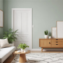
Entryways & Hallways (The Connecting Spine)
Keep your hallways and entryways in your Main Neutral (60%). Because these zones connect every other room in the house, a light, neutral backdrop creates a clean palate cleanser between distinct spaces.
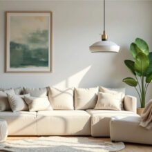
Living Room (The Common Anchor)
Use the Main Neutral on walls to keep the space open and bright. Introduce your 30% Secondary Color on a large sectional or built-in shelving, and pop your 10% Accent Colors through throw pillows, rugs, and artwork.
Kitchen (The Material Bridge)
The kitchen blends painted surfaces with hard materials (stone counters, backsplashes, and wood).
-
Keep perimeter walls neutral.
-
Apply your 30% Secondary Color to the kitchen island or lower cabinets for a custom two-tone effect.
-
Match hardware finishes (e.g., brushed brass or matte black) to accents in adjacent living zones.
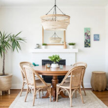
Dining Room (The Cozy Enclosure)
Because dining rooms are usually distinct or enclosed spaces used mostly in the evening, they are ideal candidate rooms for leaning heavily into your 30% Secondary Color—or even a rich shade of your accent color—for a dramatic, cozy atmosphere.
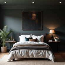
Master Bedroom & Bath (The Serene Sanctuary)
bedrooms should feel like a logical continuation of the main house while offering a relaxing environment. Pick a lighter, desaturated tint of your 30% Secondary Color (e.g., if your secondary color is navy, use a soft blue-gray tint on bedroom walls) to maintain continuity without feeling repetitive.
4. Master the “Sightline Test”
Before committing to paint colors:
-
Stand in the doorways or central hallways where you can see into multiple rooms simultaneously (the “sightlines”).
-
Hold up paint swatches for every room visible from that single vantage point.
-
Ensure that no two adjoining rooms feature harsh, uncoordinated color jumps. The colors visible in a single frame should share identical undertones or originate from the same tonal family.
Room-by-Room Palette Flow Matrix
| Zone / Room | Role in Palette | Recommended Color Strategy |
| Entry & Hallways | Connecting Spine | 100% Main Light Neutral (e.g., Warm Alabaster) |
| Living Room | Main Common Area | Neutral walls + Secondary color furniture & accent rugs |
| Kitchen | Hard-Surface Bridge | Neutral upper walls + Secondary color island/lowers |
| Dining Room | Enclosed Accent Zone | Full saturation Secondary color or deep moody neutral |
| Master Suite | Private Retreat | Softened/desaturated tint of the Secondary color family |
| Powder Room | Jewel Box | Boldest 10% Accent color or wild pattern (small footprint) |