Warm Neutral Interiors: How to Decorate Without Using Pure White
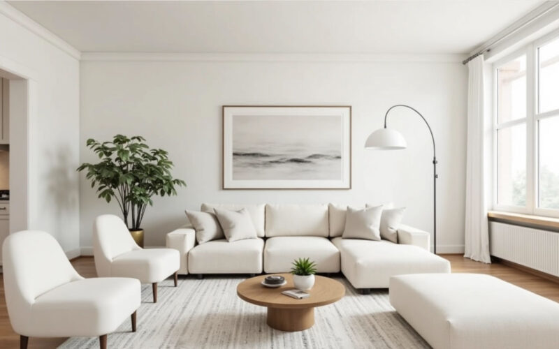
For years, stark pure white was the default choice for modern, minimalist interiors. However, pure white can often feel sterile, cold, and clinical under natural or low light.
Designing a warm neutral interior without relying on pure white allows you to create a home that feels airy and bright, yet deeply inviting, cozy, and grounded. The secret lies in layering rich off-white alternatives, subtle undertones, tactile textures, and organic materials.
Here is how to master warm neutral decorating without a single drop of stark white paint.
1. Swap Pure White for Complex “Near-Neutrals”
Instead of optic white, choose rich, complex base shades that possess subtle yellow, red, gray, or brown undertones. These shades reflect light softly, creating a soothing glow rather than a harsh glare.
-
Alabaster & Cream: Soft, buttery off-whites that add immediate warmth without appearing yellow.
-
Greige & Warm Taupe: A blend of gray and beige that offers modern sophistication while keeping spaces grounded and cozy.
-
Mushroom & Putty: Earth-toned neutrals with subtle gray-brown depth that work exceptionally well on trim, doors, and cabinetry.
┌────────────────────────────────────────────────────────────────────────┐
│                     WARM NEUTRAL LAYERED PALETTE                       │
│                                                                        │
│   BASE WALLS            ┌──────────────────────┐                       │
│   (Cream / Warm Greige) │ Creamy Off-White     │                       │
│                         └──────────┬───────────┘                       │
│                                    │                                   │
│   SECONDARY ANCHORS                ▼                                   │
│   (Cabinetry & Trim)    ┌──────────────────────┐                       │
│                         │ Mushroom / Putty     │                       │
│                         └──────────┬───────────┘                       │
│                                    │                                   │
│   ACCENT & TEXTURES                ▼                                   │
│   (Textiles & Wood)     ┌──────────────────────┐                       │
│                         │ Oak, Bouclé & Brass  │                       │
│                         └──────────────────────┘                       │
└────────────────────────────────────────────────────────────────────────┘
2. Rely on High-Texture Fabrics for Depth
When you eliminate high-contrast colors, texture becomes the primary tool for creating visual interest. Without varied tactile surfaces, a monochromatic warm neutral room can feel flat.
-
Layer Diverse Fabrics: Combine nubby bouclé, heavy slubbed linen, plush velvet, crisp waffle weaves, and natural shearling or wool.
-
Contrast Sheen Levels: Pair matte plaster walls or flat chalk paint with subtle satin drapery or smooth leather seating to let light bounce off surfaces differently.
3. Ground the Space with Natural Wood and Stone
Organic elements introduce inherent warmth, grain patterns, and structural grounding to neutral spaces.
-
Warm Wood Finishes: Incorporate light white oak, natural walnut, or warm teak for furniture, open shelving, and flooring. (Review the principles of mixing wood tones by keeping undertones consistently warm across pieces).
-
Textured Stone: Opt for travertine, limed oak, limestone, or warm-veined Calacatta marble instead of stark white Carrara marble for countertops, side tables, and decorative risers.
4. Embrace “Color Drenching” and Tone-on-Tone Trim
In standard white rooms, trim and baseboards are typically painted bright white to contrast with wall colors. For a luxurious, spa-like feel, eliminate high contrast entirely.
-
Tone-on-Tone Painting: Paint baseboards, door frames, and window trim in the exact same warm neutral shade as the walls, but in a slightly higher sheen (e.g., satin on trim, flat or eggshell on walls).
-
Slightly Darker Trim: Reverse traditional painting rules by painting walls a soft cream and trim a slightly deeper shade of mushroom or warm taupe. This adds subtle architectural definition while maintaining warmth.
5. Accent with Warm Metals and Earthy Hues
A warm neutral palette provides a versatile foundation that pairs seamlessly with natural metallic finishes and organic accent tones.
-
Warm Hardware: Choose brushed brass, champagne bronze, or oil-rubbed bronze hardware and light fixtures. Avoid bright chrome or high-shine silver, which can introduce cool, clinical tones.
-
Earthy Accents: Introduce subtle color through desaturated earth tones like terracotta, sage green, ochre, camel leather, and warm rust in throw blankets, artwork, and ceramics.
Warm Neutral Decorating Cheat Sheet
| Design Category | Avoid (Cool/Stark) | Choose Instead (Warm Neutral) |
| Wall Paint | Pure/Chantilly White, Blue-Gray | Cream, Warm Alabaster, Greige, Soft Putty |
| Fabrics & Textiles | Smooth Synthetic Polyester | Bouclé, Slubbed Linen, Waffle-Weave Wool, Leather |
| Stone & Counters | Stark White Quartz / Carrara Marble | Travertine, Limestone, Warm-Veined Calacatta |
| Metal Finishes | Polished Chrome, Bright Silver | Brushed Brass, Antique Bronze, Matte Black |
| Trim Strategy | Bright White High-Gloss Trim | Same color as walls (different sheen) or deeper Mushroom |