How to Style a Gallery Wall Like a Professional Interior Designer
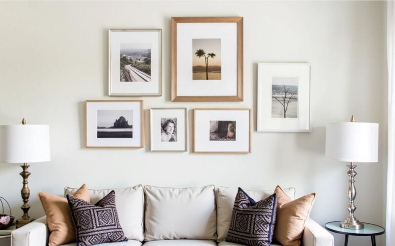
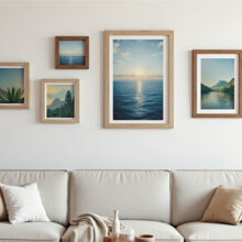
A gallery wall is one of the most effective ways to infuse personality, visual depth, and artistic flair into a room. However, without a clear plan, a gallery wall can quickly go from looking curated to chaotic. Professional designers don’t just hang frames randomly—they treat the gallery wall as a single, cohesive piece of art using balance, scale, and thematic story.
Here is a step-by-step guide to designing, mapping out, and styling a museum-worthy gallery wall in your own home.
1. Choose Your Gallery Wall Style
Before gathering frames, decide on the overall aesthetic you want to achieve. Most gallery walls fall into one of two main categories:
                          ┌───────────────────────────┐
                          │    Gallery Wall Styles    │
                          └─────────────┬─────────────┘
                                        │
             ┌──────────────────────────┴──────────────────────────┐
             ▼                                                     ▼
┌─────────────────────────┐                           ┌─────────────────────────┐
│     Grid (Symmetrical)  │                           │   Salon (Asymmetrical)  │
│ Clean lines, uniform    │                           │ Eclectic mix, organic   │
│ frames, uniform spacing │                           │ shapes, varied sizes    │
└─────────────────────────┘                           └─────────────────────────┘
-
Grid Layout (Symmetrical): Uses identical frames laid out in an exact grid (e.g., 2×3 or 3×3). This style feels formal, modern, and orderly, making it perfect for architecture prints, black-and-white photography, or botanical sketches.
-
Salon Layout (Asymmetrical/Eclectic): Mixes various frame sizes, finishes, textures, and art mediums. While it looks organic and effortless, it actually requires careful planning to achieve visual balance.
2. Unify the Collection with a Common Thread
An eclectic mix works best when anchored by a unifying element. To keep the arrangement from looking like a thrift store visual pile, ensure your collection shares at least one or two of the following design traits:
-
Consistent Frame Colors: Use all black, all natural oak, or all brass frames, even if the artwork inside varies wildly.
-
Cohesive Color Palette: Choose artwork that shares complementary accent colors (e.g., warm earthy tones, blues and creams, or monochrome black-and-white).
-
Uniform Matting: Use wide, white matting across all frames to provide visual breathing room around different types of art.
3. Mix Mediums and Textures for Depth
Interior designers rarely limit gallery walls to flat, paper prints alone. Layering different mediums creates a rich, tactile experience that feels collected over time.
Consider mixing:
-
Framed canvas art and vintage oil paintings
-
Black-and-white photography
-
Textural elements (small wooden carvings, woven wall hanging, or brass wall sconces)
-
Sketches, typography, and architectural blueprints
4. Master the Floor Paper Template Trick
Never drive a nail into the wall until you have tested your layout. Professional designers always test their layouts beforehand using this simple paper template method:
-
Test on the Floor: Lay all your frames out on the floor in front of the wall. Rearrange them until the layout feels balanced.
-
Trace the Frames: Trace each frame onto butcher paper or craft paper and cut out the shapes.
-
Mark the Hanging Hardware: Mark the exact location of the hanging hook or wire on each paper cutout.
-
Tape to the Wall: Use painter’s tape to attach the paper templates to your wall. Adjust spacing and height until the layout is perfected.
-
Nail Through the Paper: Drive your nails directly through the hanging mark on the paper, then pull the paper away and hang your frames.
┌─────────────────────────────────────────────────────────────────┐
│               THE PAPER TEMPLATE METHOD STEP-BY-STEP            │
│                                                                 │
│ 1. Arrange on Floor ──► 2. Trace on Paper ──► 3. Tape to Wall   │
│                                                       │         │
│ 5. Hang Frames     ◄── 4. Nail Through Paper ◄────────┘         │
└─────────────────────────────────────────────────────────────────┘
5. Follow Designer Spacing and Height Rules
To maintain visual rhythm, adhere to these fundamental placement guidelines:
-
Maintain Consistent Gap Spacing: Keep a consistent distance between frames. For small-to-medium frames, aim for 2 to 3 inches apart. For larger statement pieces, use 3 to 4 inches.
-
Anchor to Eye Level: The focal center of the entire collection should sit roughly 57 to 60 inches from the floor.
-
Observe Furniture Margins: When hanging a gallery wall over a sofa, console table, or headboard, ensure the bottom row sits 6 to 10 inches above the top edge of the furniture.
-
Start with the Anchor Piece: Place your largest or most prominent frame slightly off-center first, then build out the surrounding arrangement using smaller frames.
6. Balance the Visual Weight
Visual weight refers to how “heavy” an item looks. A thick dark wood frame carries more visual weight than a slender brass frame or a light drawing.
-
Spread heavy, dark, or large frames evenly across the grid or layout rather than clustering them all on one side.
-
Counterbalance a large, dark frame on the left with two medium, high-contrast pieces on the right to keep the wall visually stable.
Professional Designer Gallery Wall Checklist
| Step | Designer Action | Pro Tip |
| Concept | Pick a unifying color scheme or frame style | Limit to 2–3 main frame finishes max |
| Curate | Combine photography, paintings, and 3D objects | Use white mats to ground busy prints |
| Plan | Lay pieces out on floor & create paper cutouts | Mark nail holes on paper templates |
| Hang | Keep 2″ to 3″ gaps between frames | Use a bubble level on every single frame |